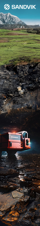

Sandvik has presented a new visual identity that, it says, highlights the company’s commitment to lead the shift towards digitally driven and automated industries.
This new identity is developed to suit the current position of the company as a technology leader enabling improved productivity, efficiency and sustainability for its customers, it said.
Over the past few years, Sandvik has implemented a new strategy and defined a common purpose: “We make the shift – advancing the world through engineering”. This, in combination with fundamental changes like strategic acquisitions and the 2022 listing of business area Sandvik Materials Technology, has reshaped the company and secured a strong foundation for the future, it says.
Stefan Widing, President and CEO of Sandvik, said: “Sandvik has in many aspects become a new company in recent years. We have strengthened our world-leading positions through innovation and strategic acquisitions, and we want to continue to build our technology leadership and keep driving productivity and sustainability gains for our customers. Reflecting this, I am very pleased that we reveal a new, modern brand identity and logotype fit for our purpose and strategy.”
Sandvik is on a path of transformation, building what it says is a unique position combining hardware with software and digital solutions in the mining, manufacturing and infrastructure industries, with solutions improving sustainability and productivity for customers on a global scale. A crucial part of this is a focus on collaboration and co-creation to deliver these cutting-edge solutions.
The updated brand identity represents this new, modern Sandvik, and rests on three core elements – proactive partnerships, forward-thinking solutions and sustainable progress. The logo is inspired by the 1962 Sandvik logo and is a tribute to the company heritage and history. A new symbol is also introduced, intended as the key bearer of the Sandvik brand and the mark of the corporate purpose. It represents “progress” and “circularity”, visually summarising the commitment of Sandvik to advance the world through engineering, the company says.